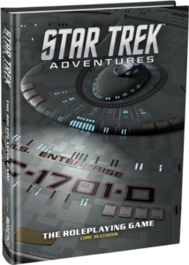
 Late last week, Modiphius released links to preorder their new Star Trek roleplaying game, Star Trek Adventures. Visually, it looks cool, perhaps up there with Fantasy Flight Games’ Star Wars RPGs, a series of game books that does a lot of things right. The cover of the collector’s edition is a very interesting angle of The Next Generation’s Enterprise’s main hull, rendered by the same people that provided the 3d model for the Star Trek: TNG Remastered series. The cover of the regular edition is original artwork — an illustration! ((Aside: When we worked on Firefly, we had illustrations for the covers. We heard from the distributors that they would not sell unless we had photos of the crew instead of illustrations — a claim I always thought of as full of crap. It’s great to see that a game based on an existing IP is going forward with an illustrative cover.)) The one spread we have of the interior also features an illustration of Picard’s Enterprise being harried by Romulan ships (and the announcement comes with another illustration of a starship battle!). This leads me to believe they’re going full-on illustration with the game rather than just using stills from existing movies and television shows ((Firefly chiefly did that to save money on production costs.))
But that spread — I’d like to take a few minutes and write down what I really like about it and what I see in the layout.

There it is, all in its LCARS glory.
While I’m not a fan of light text on dark paper ((he types, realizing that his preferences in Writemonkey are a light cyan type on black)) for print ((See also: The Sprawl’s MIDNIGHT and NOON editions.)), Modiphius does a good job emulating the Enterprise’s in-universe graphic design. It’s actually pretty neat how they did their two headers on the left page — the way to do that in InDesign is with indenting, paragraph shading, and an adjustment to the corners. ((Possibly a separate text frame.))
The spread also does the two things right that I always look for in layout.
 First of all, see that quote on the top of the left page? Looks nice, right? What I’m really looking at is the hanging quotation mark at the very beginning. It’s to the left of the text frame, which means the layout designer turned on Optical Margin Adjustment. What this does is moves elements of the copy near the margins to improve readability: things like hyphens, quotation marks, and other punctuation when constrained to the left and right sides of a text column make the nice, clean lines look uneven. Optical Margin Adjustment also adjust some characters at those column edges: see how the lowercase t in the image ((from Adobe’s website)) has the left part of the crossbar hanging outside the margin to better visually align the stem of the letterform with the margin.
Optical Margin Adjustment is a thing I always wonder why InDesign doesn’t have on as default.
The second thing ((really, the first thing I notice)) is they’ve aligned their text to the baseline. What that means is if you draw a line from a bit of copy in the left column, the copy on the right lies directly on that line. This gives a cadence to the work and keeps the leading consistent throughout the work, reinforcing a positive feeling. There’s a good article at Smashing Magazine about pattern recognition and the visual cadence, but it’s really the psychological aspect of the work that’s important:
“…the baseline alignment of adjacent paragraphs (or headers) is delightfully calm when done right, and annoyingly disruptive when implemented badly or not at all. The quiet order arriving from horizontal alignment exhibits a visual confidence, an invisible scaffolding that holds everything in place and reassures the readers at a subconscious level. A book with every line on a left hand page aligning with their counterparts on the right simply feels trustworthy; a book where the lines don’t match up at all somewhat less so.” ((Quote and image following from Smashing Magazine.))

This baseline alignment means that headers have to be carefully planned. The header 1s and header 2s in this spread have to be sized correctly to allow for proper placement. Space above the “Adventures Beyond the Final Frontier” is more or less equal and nicely reinforces the main body copy’s horizontal alignment, even if the actual text in the header isn’t aligned to the baseline. The “Engage Roleplaying” and “Playing a Role in Starfleet” are aligned and sized nicely, providing a good amount of separation between paragraphs while standing out as header elements.
There are a few things that I’d recommend to the layout artist, mainly dealing with hyphenation. First, it’s okay to use hyphenation, even with ragged right copy. The default InDesign hyphenation settings are awful ((The hyphenation settings are one of the first things I adjust, to words with 8 characters and 3 letters at start/end of the word.)) but there isn’t any reason to fear them. I can tell they have it off because the ragged edge of the left-justified text is too ragged.
Note the paragraph immediately following the “Playing a Role in Starfleet” header. The first three lines look nearly full-justified, but the “a” that starts the second paragraph could have gone on the end of that first line, but that would push “discover” from line three to the end of line two, and you’d most likely need some hyphenation there.
And while we’re talking hyphenation, there the registry numbers for Starfleet vessels should have a setting in the GREP Style to apply no break to anything fitting the NCC-1701 numbering system. You can see where the various Enterprise registry numbers break in the “Yesterday’s Enterprise” sidebar. It’s like writing a phone number like this:
Adobe Customer Support is: 800-833-
6687
No.
Also, there should be some sort of LCARS treatment to the border between the illustration and the regular book copy. The blues in the space illustration (and I’m assuming there’s going to be a lot of those) and the paper background clash. Maybe something like…

Oh, and I really like how the sidebar is done. I think I know how to replicate that entirely with text and graphics frames (no actual Illustrator artwork), but I’d have to try that out. Given the way I think it’s done, you can do a lot of stuff with the LCARS-like sidebars, making them all look just a bit different while keeping the style. I like.
So there’s some thoughts on the layout of Star Trek Adventures from just looking at one spread in a promotional email. I’m looking forward to seeing how the final book looks. ((Even though I’m not a big Star Trek fan.))