Last year, I was asked to write about the Coolest looking RPG product/book I have.
I’m not going to name anything I’ve worked on here, because (a) I don’t want to appear as someone that thinks his own work is superior to those of others and (b) when I look back on things I’ve worked on, I just see elements that I should correct or improve.
Recent purchase, that’s FFG’s Star Wars line of games. I went on and on about Age of Rebellion earlier on the 4th. Rather than repeat myself, let’s just link it in. ((Original link: https://plus.google.com/+ThomasDeeny/posts/a8oKdEwVyr5 ))
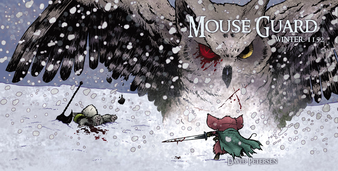
Slightly older book ((Which would be 2008.)) , I’m gonna go with Mouse Guard. It’s a cool looking book and, like the Hellboy RPG and Marvel Heroic, designed to fit the form factor of the actual comic. The overleaf, the treatment of each page’s outside margin, the color of the ink chosen (and the typography), and one of the best uses of licensed artwork in an RPG.
Mouse Guard uses a book design element used in most of Luke Crane’s games (and in Fate’s Atomic Robo): three icons to indicate important passages of text (which, in any other game, would be a sidebar). I am not a fan of this technique. I feel it often doesn’t work the way it is intended, and it interrupts the flow of the text. Here, in Mouse Guard, it actually complements the layout design instead of detracting from it. ((For everything I like about the layout of Atomic Robo, that’s the one thing I wish was dropped or done in a different way.))
Everything about the look of the Mouse Guard book is fantastic.
There is no credit in the book for graphic design or book layout, so I’m assuming it was Luke Crane himself. Good show, sir! Not everyone can layout their own work, yet alone do it this well. (There are so many other games on the market that speak for that!)
What about today, sir?
Man, I still have to back to Fantasy Flight Games’ Star Wars RPG line. The art direction is simply stunning.