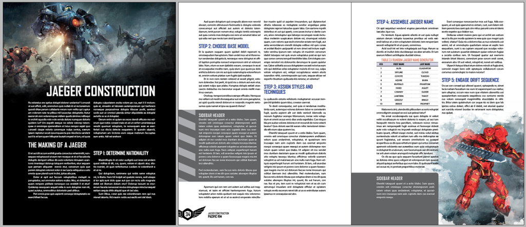
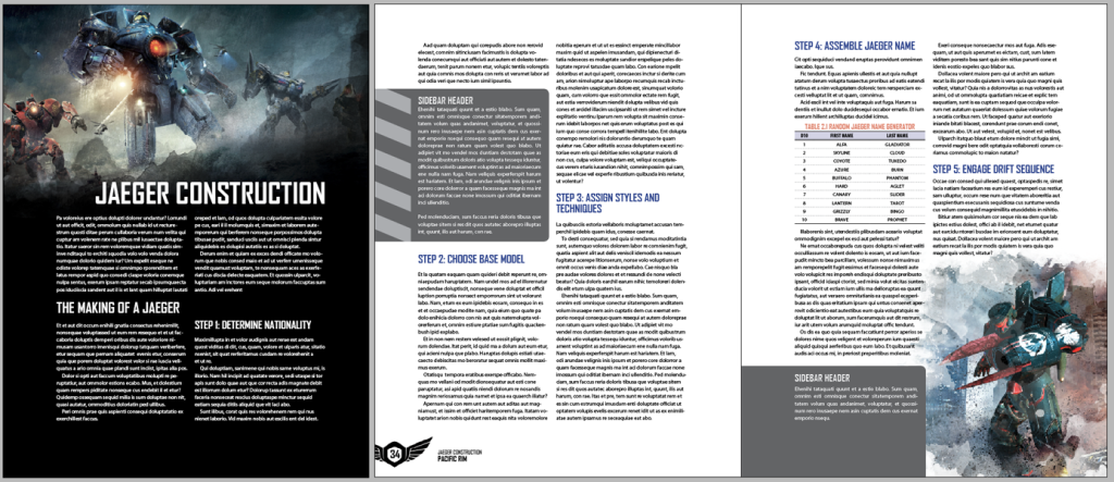
Last week, I took a little bit of time to do some layout doodling. This time, the inspiration comes from the Pacific Rim movie and looking at other people’s InDesign and Photoshop files.

Honestly, just looking at how other designers go about setting up their Photoshop, InDesign, and Illustrator files is an educational experience. It’s a look into how other designers think, what their thought process is, and how they overcome problems in their designs. For instance, in the past two projects I’ve worked on, I’ve examined how others use the intricacies of master pages in InDesign, the power of grep and nested styles (which I use, but not to quite the extent that I’ve seen), various methods for adjusting text wrap around images.
It’s this insight into the developmental files of final material I wish I had on other products. When I purchase a PDF of a book with an interesting table style or an intriguing way of displaying a graphic, I often wish I could peek at the InDesign file to see how they did it ((Also to edit typos and clarifications once the errata is published. And maybe align copy to a consistent baseline.)). Some designers are easy to find and are open for questions ((Like how John Harper answered a few questions I had regarding Ghost Lines, including making the InDesign file package freely available: http://mightyatom.blogspot.com/search/label/ghostlines )) , but most often it’s looking in and guessing what they did.
Bonus Jaeger Random Name Generator from the above layout:
| d10 | First Name | Last Name |
| 1 | Alfa | Gladiator |
| 2 | Skyline | Cloud |
| 3 | Coyote | Tuxedo |
| 4 | Azure | Burn |
| 5 | Buffalo | Phantom |
| 6 | Hard | Aglet |
| 7 | Canary | Slider |
| 8 | Lantern | Tarot |
| 9 | Grizzly | Bingo |
| 10 | Brave | Prophet |
Bonus Link: Pacific Rim main theme, remixed “in Chinese style, just for Crimson Typhoon!” https://soundcloud.com/impossiblechuck/pacific-rim-crimson-typhoon-1
