Finally! Done with the reposts of first games I’ve played/run/purchased. On to new stuff! Let’s see what the most recent RPG I purchased was last year, then let’s dig into this year!
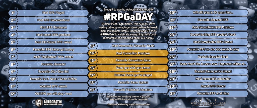
#RPGaDAY, Last Year: Day 4: What was the most recent roleplaying game you purchased?
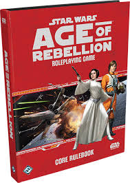 That’s Fantasy Flight Games’ Star Wars: Age of Rebellion from their incredibly profitable line of Star Wars roleplaying games. While I’m tempted to take this time to write about Star Wars’ lineage in gaming ((Did you know that West End Games made up quite a bit of Star Wars’ non-movie lore in an era when there were just three movies, Splinter in the Mind’s Eye, and the Han Solo/Corporate Sector trilogy to draw from?)), or how FFG has really monetized the Star Wars line. ((Three separate game lines based on the focus of stories you wanted to tell and selling beta versions and “beginner boxes†for $30? All of which are well worth it, for production value alone.)) One thinks other companies would have the base game, then a criminal underworld sourcebook, followed by a rebellion one and a Jedi one – not three separate game lines backed by dozens of support products. ((It’s also odd that FFG didn’t start with the galactic civil war, which is what I think as what Star Wars is all about – I mean, heck, it has the word “Wars†in the title – as the setting for the game is just before Empire Strikes Back. Instead, they start with the Han Solo book, so you’ve got Shadowrun in Space as your default Star Wars setting)), or how it sucks that FFG isn’t releasing PDFs of the line ((PDFs are electronic products, so they fall under a different licensing agreement with Lucasfilm. FFG can produce PDFs that they will never charge for, like the Under a Black Sun adventure or pregenerated characters that aren’t in the starter kit.)), or my personal journey through various Star Wars games and how I fell out of love with the series ((West End Games’ d6 Star Wars was the backbone of one of my favorite campaigns. Wizards of the Coast’s Saga Edition I never played because I hated, hated, hated the d20 system. FFG’s, I’ve run a few times and absolutely enjoyed the times I played it.)).
But I’d like to write about the graphic design of the FFG line.
The books are absolutely fantastic. As a layout designer, there is a lot to learn in just the Age of Rebellion core book. Original illustration – not just publicity stills and movie shots as provided by the IP holder, as you’d see on most licensed games – fill the book. I estimate that there is one piece of artwork every three pages. Most of the lines I’ve worked on suggest one every five pages. And these aren’t small illustrations, either! There’s an illustration of an X-Wing pilot removing her astromech droid from the crashed ship while far above, nearly lost in the sky by atmospheric perspective, the battle continues, just outside the atmosphere. This illustration takes up the entire page, with the composition allowing for the copy of the game text to flow normally on this page. Yet, with all this artwork (and copy overflowing the art in places), the book is nice: legible and readable. Why?
Headings! Apart from chapter headings, the books are laid out in a tightly-controlled number of headings. Three headings, with that last one used sparingly. (A nice change from a recent job that had six levels of headings, all of which were used differently by writers working on their own sections.)
Typeface choice! The typeface used (ITC Symbol, it looks like) has an elevated x-height and is well crafted, giving the letterforms room to breathe. For a game book, where one has a great deal of copy to reference during play, this is essential. The layout of the body copy is a bit jarring, as the template designers have the paragraphs both indented and with space between paragraphs. This is wrong, wrong, wrong. Indent or space before, not both. The copy presentation is almost perfect. I could forgive the paragraph spacing issue if only they aligned the copy to the baseline. ((The book’s second typographical sin. Most of the time the designers get lucky because the number of paragraphs and headings sort themselves out, even if the middle of the page gets mis-aligned. Having lots of graphics and having the text wrap around them also helps to disguise the lack of baseline alignment.))
Overall, the typeface treatment works, even with the justified copy. There are very few places where the copy looks cramped or too airy due to auto-scaling, the bane of justified paragraphs. Why? Because they weren’t afraid of hyphenation. The key thing to remember with InDesign’s hyphenation rules is the default settings are crap. Here, FFG adjusted them to improve readability – even in a column with twelve hyphenated words, they do not appear jarring. (This is partially because of the look of ITC Symbol’s hyphens.) The shortest word I have seen hyphenated in AoR is six letters, so I’m assuming they changed the defaults to that minimum length with hyphens no sooner than after the first three letters and no later than before the last three. ((InDesign’s default is five letter words and two letters from either side. This is as bad as turning off hyphenation completely when using justified copy.))
Tables are clean and easily-readable, as are the use of dice glyphs. The basic page layout emphasizes the feel of both games in the line so far: you’re dirty scoundrels/rebels trying to make by. Everything around is dirty and grimy. ((When I think of the Rebellion, the texture I associate with it is grease from ball bearings or working on an old car. It gets everywhere.)) The texture on the background pages subtly conveys that.
That’s a lot of words so far, and I’ve got to get some real work done today, so let me leave you with this: Age of Rebellion is a fantastic-looking book.
What about this year, Thomas?
Oh, well, you’ll see in a few hours. (The same question is this year’s day five.) Hint: the design of the book is as stunning.
 Character creation should last an entire game session; some players will have to finish making their characters before the next session, but probably won’t.
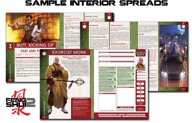
 So Feng Shui 2: Action Movie Roleplaying Game is done by Atlas Games and Hal Mangold did the layout on this book, and that’s why I backed it to get the PDF. The bad thing about this is Feng Shui is a game whose subject just doesn’t interest me at all. ((For gaming, I’ll point out. I don’t particularly care for the genre as a thing to play, but the movies? Yeah. They’re pretty cool.)) Given a chance between playing this and another game, I’d probably pick the other game. But the book is so beautiful. So skillfully laid out. It’s one of the best graphically-designed games of the past year.
 That’s Fantasy Flight Games’ Star Wars: Age of Rebellion from their incredibly profitable line of Star Wars roleplaying games. While I’m tempted to take this time to write about Star Wars’ lineage in gaming ((Did you know that West End Games made up quite a bit of Star Wars’ non-movie lore in an era when there were just three movies, Splinter in the Mind’s Eye, and the Han Solo/Corporate Sector trilogy to draw from?)), or how FFG has really monetized the Star Wars line. ((Three separate game lines based on the focus of stories you wanted to tell and selling beta versions and “beginner boxes†for $30? All of which are well worth it, for production value alone.)) One thinks other companies would have the base game, then a criminal underworld sourcebook, followed by a rebellion one and a Jedi one – not three separate game lines backed by dozens of support products. ((It’s also odd that FFG didn’t start with the galactic civil war, which is what I think as what Star Wars is all about – I mean, heck, it has the word “Wars†in the title – as the setting for the game is just before Empire Strikes Back. Instead, they start with the Han Solo book, so you’ve got Shadowrun in Space as your default Star Wars setting)), or how it sucks that FFG isn’t releasing PDFs of the line ((PDFs are electronic products, so they fall under a different licensing agreement with Lucasfilm. FFG can produce PDFs that they will never charge for, like the Under a Black Sun adventure or pregenerated characters that aren’t in the starter kit.)), or my personal journey through various Star Wars games and how I fell out of love with the series ((West End Games’ d6 Star Wars was the backbone of one of my favorite campaigns. Wizards of the Coast’s Saga Edition I never played because I hated, hated, hated the d20 system. FFG’s, I’ve run a few times and absolutely enjoyed the times I played it.)).