When starting on a new book project, one of the first things I think of are the typefaces for the interior. How to choose what to use to convey the information to the reader? How heavy should the type look in a character, line, paragraph, and on the page as a whole?
I see four major areas for copy treatment when it comes to roleplaying games: the body copy, the headings, the sidebars, and the tables. Depending on the game, there may be statblocks that need to be detailed, but for the most part a treatment that incorporates the sidebar and table styles are a good starting point for these. I do not consider statblocks as high in the hierarchy of design elements as tables or sidebars are.
I tend to start with the body copy, most usually with one of the classic serif typefaces I have licenses for: Garamond (three different typeface variations), Jenson, Caslon ((Which I have never used. I keep looking at it and putting it back on the shelf.)) , Warnock ((A relatively new old-style typeface, first published in 2000 as Warnock Pro, but I constantly refer to it as just Warnock.)) , Bembo… basically classic old-style typefaces. I love the looks of these: the x-height and sizes of the counters help the readability of large blocks of copy on paper. For rpgs with contemporary settings or a setting in the past, I like to start here — I associate serif typefaces with the past, sans-serif typefaces with the future.
I’ll start branching out as I look at headings. ((Years of early HTML programming has me swapping the term “heading” and “header” around like they’re the same thing. If you see me use “header”, it’s really supposed to be a “heading”.))
When it comes to headings, there’s two competing standards I’ve been taught. The first is to keep the same typeface for heading as the body copy — we just increase the type size, adjust the weight and style, and perhaps use all caps or small caps variations. Part of the reasoning behind using different fonts within the same typeface ((A typeface is a family of fonts, like Helvetica Neue. A font is a specific weight and style, like Helvetica Neue 47 Light Condensed — and to a more accurately technical example, Helvetica Neue 47 Light Condensed 12pt is a different font than Helvetica Neue 47 Light Condensed 18pt. All of the variations of Helvetica Neue combine to make the full typeface.)) throughout the work imparts a sense of visual compatability. A typeface that is set at Book and 12pt for body copy, using the same typeface at Bold and 18pt for first-level headings, and using Bold Italic at 12pt for second-level headings have the same elements of the typography through the piece, nicely tying the work together.
However, I rarely follow that method.

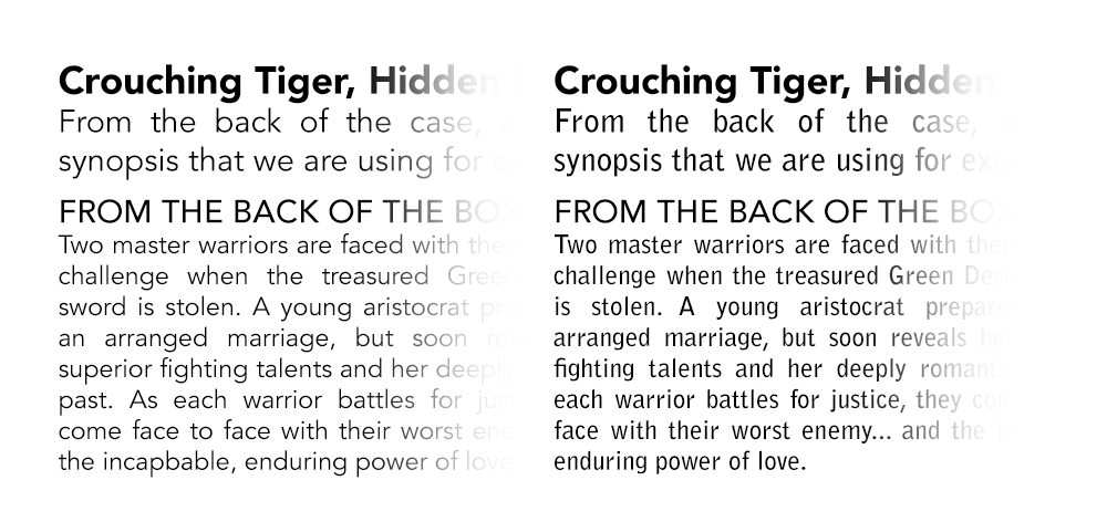
Instead, I gravitate to the other method I was taught: pair san-serif with serif. In other words, if the body copy of the text is set in a serif typeface, the headings will be in a sans-serif typeface. This is a classic combination of styles to make your work stand out and easily break up the columns of text we find in most roleplaying game books. In the example above, there’s Adobe Garamond Pro for the body copy and the headings on the left; the headings on the right are variations of Avenir ((Avenir LT 65 Medium)) set at the same height, weight, and style as on the left.
Different sans-serif (and different serif) typefaces for headings and body copy can create conflict through the . Below, the same type set with two different pairings. The spacing (kerning) in Bell Gothic — the body copy on the right — are too uniform for my tastes. They feel machined. The open forms of Akzidenz Grotesk (left body copy) has better kerning for longer passages for my tastes. The word forms created feel like words rather than collections of letters. But more importantly, compare the word “synopsis” with either Avenir heading — they seem to fit more comfortably together when the body copy is Akzidenz Grotesk than Bell Gothic.
Given those basics, I’ll start creating a few layout combinations. Eight, maybe. These take into account the feel of the material (as I understand it), what type of game this is (like the layout for a humorous horror game like Demon Hunters should feel different than the layout for a more serious horror game like Unknown Armies), and the actual size of the book.
My rule of thumb is to have a two-column layout for books that are US Letter/A4-sized (Dungeons & Dragons) and a single-column layout for a digest-sized book (Fate Core System). This is due to something I was taught about readability years ago: generally, the width of a text column should be two and a half the length of the lowercase alphabet. There was some talk about eyestrain traveling all the way across a column of text, but really it’s one of those things I remember from the formal education that might be an old layout artist’s tale, handed down from graphic designer to graphic designer. ((Like how Macs are better machines for graphic design than PCs that run Windows.)) But it looks good to me.
abcdefghijklmnopqrstuvwxyzabcdefghijklmnopqrstuvwxyzabcdefghijklm
From that rough line, I’m picking the body copy font size and leading. (I’ll print out several sheets and compare them to other books that convey similar amounts of information. I’ll ask myself: Do these read well? Does the page feel crowded? Is there too much space?)
And then I’m looking at sidebars.
Here, I tend to do two things to distinguish sidebars from general body copy. First, default to white text on a dark background, assuming that the rest of the book is dark-colored text on a light background. This provides an instant, visual effect. Secondly, reinforce the difference between sidebar and general body copy by swapping the serif/sans-serif styles for headings and body copy with our sidebar headings and sidebar copy. Again, there are a great many options to go through, but even with something like 7th Sea where we kept the headings in the main text and the headings in the sidebars using the same typeface, we have the body copy in sans-serif and the sidebar body copy in serif.

Tables (and statblocks) tend to come after rounds of sidebars have been reviewed. Invariably, I’ll start looking at the heading 2 and heading 3 styles to develop the titles of the tables and the sidebar body copy for the material within the table. But honestly, at this point the major choices in the layout for the family of typeface I’m using has been made. The presentation for tables just evolves from what’s composed.
…and my other secret is to look at what other people have been doing. I’m looking at books not just in the RPG marketplace, but things like high school and college textbooks or video game guide books. For instance, the Vault Dweller’s Survival Guide — the game guide for Fallout 4 by DK/Prima Games — is fantastic. This is a book that has headings, subheadings, artwork, sidebars, bullet lists… tons of things that you would find in a typical roleplaying game book. It’s a US Letter-sized book, with two columns of serif body copy and sans-serif headings. I’m tempted to tear this book apart in a future writing about layout and showcase some of the fantastic things this does (and doesn’t) do. (Screenshot below is at horrible resolution. Sorry!)

So, the other thing I found myself referencing when I got into layout was an article at Smashing Magazine titled “Best Practices Of Combining Typefaces”. Written in 2010, I highly recommend the article to graphic designers starting out in their career. It contains several short examples of pairing typefaces in a short passage, focusing on some good general advice for headings and body copy.