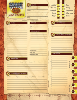
The design of a role-playing game’s character sheet seems to come at the end of the design process, in my experience. For most games, this means that the design of the character sheet is influenced by the design of the 200 or so pages that were designed before it. Other game’s character sheets, such as the one I recently did for Space: 1889, are also influenced by other character sheets from the game line. In the case of Space: 1889, not only was the sheet supposed to be a sheet for that specific game, but the sheet had to function as a Savage Worlds character sheet, which meant there were certain things that had to be on the final product. The result works and I think it’s a good sheet while working in the constraints brought about by the overall game line (as the designer, I may be biased).
 When designing the sheet, the one thing to consider is how the sheet is used in play. Savage Worlds character sheets use something that other game systems don’t: the paperclip. Savage Worlds has its roots in Deadlands, an incredibly popular game back in the day that required the players to have—in addition to dice, pencils, and the character sheet—a deck of cards, poker chips, and colored paper clips. Those paper clips were used on the side of the sheet to mark wounds, ammunition, and various conditions your character was in. All Savage Worlds games’ character sheets continue this tradition with their ammo track and wound levels. Not only did the front and back of the sheet need to be referenced, but the placement of the paperclips needed to not interfere with reading the other side.
Remember last post, when I said that the logo on the Pathfinder character sheet seems to be the most important thing on that sheet? I think this sheet has the same problem. In the small image here, my eye is drawn straight to the Space: 1889 logo, then across the top because of the horizontal rules, and over to the attributes. The vertical lines in the attributes guides the eye down to the hinderances and edges section. As the designer of this page, I really regret not having the skills in that section; the attribute + skill element of the game should be better reflected here. Although I am proud of what was done on this sheet—in particular, I really love the ammo tracker at the bottom of the sheet—this is the one thing that nags me. (Ask any designer if they are ever completely satisfied with their work. Go on.)
While I’m a bit dissatisfied with the prominence of the logo, I think the Pathfinder character sheet does it correctly, but for different reasons. In Space: 1889, it appears in the upper left corner for a few reasons: because we read from top to bottom and left to right, and because gamers tend to stick with one system. For Savage Worlds, “sticking to one system” means that they tend to play different plot point campaigns. Logo = easy to find the right character sheet. (In case, you know, the look of the actual sheet doesn’t tip you off.) But for Pathfinder, it is there for another reason.
Take into account this: when Pathfinder launched, it was a gamble. People weren’t sure which way the D&D crowd was going to go: to D&D 4e, to Pathfinder, to sticking with the ample supply of 3.5 books. Walk into a game store on RPG night. See that? The majority of games playing look like D&D. Look at the tables. In front of every player is a character sheet.  There might be a few books out in front of the GM, maybe a book or two by the players, but right there, at any place around the table, are those character sheets. The one thing—the only thing on that sheet—that is in color is that logo. There’s plenty of white space built up around it. All that white space helps to separate the logo from the thick block of statistics. Each official Pathfinder character sheet is a small piece of advertising.
Next time, we’ll look a bit more at some different purposes of character sheets with some examples of well-designed sheets. See you next week!