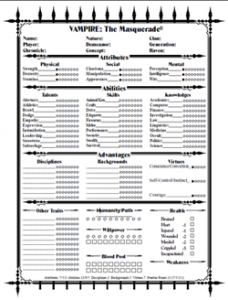
 The job of a graphic designer is not to make things look pretty; it is to communicate information. Today, we were talking about character sheets in roleplaying games on Twitter, specifically the Vampire: the Masquerade sheet. Daniel writes that his biggest issue with that sheet “is the lack of emphasis on the core theme of Humanity vs Beastâ€. A look at the sheet he was talking about not only illustrates his issue, but also illustrates a fatal flaw in the character sheet: there is no hierarchy of information. Nothing on the sheet tells you what is important for the game: everything on the sheet has the same weight or visual density and becomes a wall of nothing. (The wall of nothing would be especially troublesome when that sheet has information added to it by the player.)
It is my belief that character sheets for roleplaying games are for reference. What is on the sheet is a record of things to reference in play. That your character is male is a fact you most likely won’t need to look up during play; in a game like Pathfinder, your character’s Knowledge (Arcana) score is. With that in mind, let’s look at that sheet. (All sheets are reduced in size to reduce readability and emphasize the general layout of the sheets.)
 For the Pathfinder sheet, the thing that automatically attracts the eye is the logo. It’s big, in color, and obviously must be the most important thing on the sheet. Underneath that, you’ve got an interesting swoosh of black bars, really thin at the top (where the six attributes are) and widening down to the weapon records. After that, the next most important thing is the Speed/Skills thing at the top right (although there’s nothing that visually leads one’s eye to that area – once you get to the bottom of the Weapon stack, you’re effectively done with the page).
The six attributes in a very prominent location on this sheet indicate they are supposed to be important, but what is really important when playing the game are things derived from the attributes: skill ratings, attack ratings, and others. In play, the things that are referenced most often are the skills, the attack ratings, and the character’s defense ratings (AC and saves). The area that is interacted with the most is the HP block (the game is all about managing hit points). The only time the six attributes seem to be used are when first determining modifiers to the other elements of the character sheet and when a character reaches a certain level and can increase an attribute (which in turn increases other elements on the character sheet).

So why does the Pathfinder sheet display these six attributes right under the only colored element on the page? Why right at the top of the swoosh of black bars? Why in the upper-left corner of the page where western readers are trained to look when reading a page? Because that’s where they were in Wizards of the Coast’s D&D 3.5 character sheets. Because that’s where those where in the 3.0 sheets. And that’s where they were on the AD&D sheets. Back in that game system, the attributes were used in game, often as much as skills are used in modern day Pathfinder.
The block of attributes is there because of tradition and because they wanted to tie it into the existing fan base. They wanted the character sheet to be familiar to people playing 3.5. Take a look at that character sheet—they basically took that sheet, made it a little bit prettier and added the Pathfinder logo.
Next week, I’ll talk a little bit more about tradition in character sheet design, including critically critiquing a character sheet I recently did for a Major Game Publisher.