When obtaining art assets for books in the roleplaying industry, I have noticed there is a lot of input into getting the interior artwork and cover artwork. With selling pdfs (and other electronic editions) through places like DriveThruRPG, you’ll find that those files have the front cover, the back cover, and the interior. They are usually in that order so you can view the pdf as a two-up document with a separate page for the front cover, preserving the page spreads in the printed work. What seems to be forgotten — or at least not considered fully — is the treatment for the spine of the book. I find this odd, because at a store, your book is more likely to be shelved spine-out.
I hadn’t really noticed this until I developed the cover for Magpie Games’ Urban Shadows. For that book’s cover, we only had the front artwork which was to be placed on a black background. The back artwork was a composite of four of the character types, combined specifically for that space. We used an interesting typeface for the logo (and some chapter headings) with a white fill at about 85% opacity, re-purposing it for the spine. I wanted to make it big, bleeding over the edge of the printed spine. As a happy accident, this wound up looking amazing on bookshelves.
Why?
High contrasting colors. The size of the letterforms. The fill of the counters in the R, B, A, D, and O.
 Vincent Baker posted an image of a shelf filled with translations of Apocalypse World and a collection of Powered by the Apocalypse games. That high-contrast aesthetic seems to carry through his line of games (and has an influence in games adapted from Apocalypse World — see also how PbtA games tend to have stark black and white images for protagonists on playbooks, even if that art style doesn’t fit the game). A lot of these spines are legible from a distance. I’m simulating this with a small version of that image to the right. What pops out? Monster of the Week on the end. The oversized Apocalypse World translation. And I’d say tremulus or Dungeon World next.
Monster of the Week is prominent here because there’s some large, solid text with a high contrast in color values. Monsterhearts doesn’t, mainly because of the typeface — the letterforms are top-heavy and thin out as they go down. tremulus also works, but that’s because there’s a solid white for the title and a muted color for the rest of what is on the cover. Plus there’s a lot of space around “tremulus” on top, bottom, and left, so it floats, white in a sea of black. ((Personally, I would have that whitespace wrap over to the right of the title and maybe knock the “a storytelling game of…” copy down a few points.))
 One of the first images I saw of Urban Shadows in the wild was Jonathan Perrine’s bookshelf (reproduced here, also sized for effect). Yeah, you can totally see Urban Shadows. But what’s next? Fate Core System. Wicked Fantasy, Fate Worlds, and Fate Codex are next for me. The Marvel Heroic Roleplaying Civil War supplement has elements that are readable from a distance, but maddeningly the words “Civil War” aren’t. To the right is the MHR basic rules book, but the only thing really noticeable from across the aisle at your local game store is the publisher’s logo. Oh hey, there’s my main client’s Blood & Honor using a scripty logo that’s difficult to read. I only recognize the book because I know the book. On The Aegis Project‘s spine, the only thing that stands out to me is the name “WICK”.
While most of these examples have been from one-off games, the spine can reinforce a game line (or series of books). Recently, Dave Chalker posted this image of his bookshelf after moving and consolidating his game collection:
Aside from how Edge of the Empire stands out ((…as does every book in Fantasy Flight Games’ Star Wars series.)), I’d like to look at that top shelf with the Dungeons & Dragons books. There are books from different editions of D&D, each edition with their own trade dress (basically, the overall look, signifying that different products belong to the same family or line).
The three books near the left, with a blue, maroon, and green spine, are the core books for D&D‘s 4th Edition. These work well for the line with the pointed whitish shape with the D&D mark, which is in use in the nine books on the right of that shelf. These are followed with the books’ title, centered, at the same size across the line. The bottom of the spine has a shape that mirrors the pointed white shape at the top of the spine, serving as the backdrop of a character piece. It’s pretty sharp — you can tell you’re looking at a Dungeons & Dragons book — and you can read the titles, even with the serif typeface because they’re using high contrast: off-white text on mainly dark colors.
Rulebooks have the triangular points by the wordmark. Adventures have a simple diagonal. Campaigns and setting books have two different types of shapes. ((As I’m not familiar with these products, I am not certain why a book about the Forgotten Realms setting would be classified as a “campaign guide” and one about the Dark Sun setting is in the “campaign setting” group.)) Even the subtypes of these have secondary coding: color. All the player rule books have a blue spine color, the DM books are maroon, the monsters green, Dark Sun books are black, books about power/magic are purple…
And then a new edition is released, those eight books with black spines with the red banner at top. Oh! They are so close — the resizing of the red wordmark based on page count is a shame. It tells me at a glance that the two books on the right are so much shorter than the four on the left. Compare the thinner 4th Edition books on Dave’s shelf with the thicker ones — they’re still in line, they still look like part of the same thing. The 5th Edition books? That mark varies so much and start asking unintended questions: Are the last three books lesser books in the line? Is the fifth book not as important as the first four? The first three books are the core rulebooks for the game. The fourth is an adventure that’s as every bit as good as the two that follow — why don’t these have their branding standardized across the line?
Oh, it would have been great if they all had the same size for the red mark and didn’t resize for something as arbitrary as page count (which is a little bit strange as all three core books don’t have the same page count). In fact, everything but those three are adventures. Take a cue from the prior edition and denote them as different? The line currently has three types of books: rulebooks and adventures, like on Dave’s shelf above, plus setting supplements. ((And while we’re looking at those black spined D&D books, take a look to the next book on the shelf: that’s 2nd Edition’s Dungeon Master Guide.))
One last thing to look at: Fantasy Flight Games’ Star Wars RPG line. This image ((from https://stickybunton.com/2016/06/15/why-wait-for-free-rpg-day-get-free-rpgs-today/ where he talks about how they didn’t get as much love as he hoped)) features several books in the Edge of the Empire line.
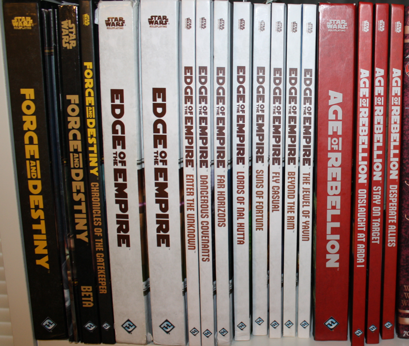
The line of sourcebooks looks great on a shelf: EotE logo mark in the same place and (again) with high contrast draws you to that section, allowing you to shift to the secondary information on the spine: the actual book’s title. With a line of RPGs, they’re going to be placed on a shelf at your house or in the game store together. All these white books with the dark brown text? You’re drawn to the line — now to find the specific book you want. A lighter brown, thinner typeface, all starting at the same location (well, except for printer issues on the Lords of Nal Hutta book), and all the same size is what draws the eye next. I think this is a great spine treatment for the line.
Those core rulebooks, though! FFG knows the three core books are going to be the same size. The title sits in a field of negative space and the text just pops! Other books sitting next to it, like in Jonathan’s image way up there, don’t matter to Age of Rebellion‘s core rulebook. The book creates its own space, its own buffer between title and whatever other book you might have on your shelf. You want to grab Age of Rebellion off the shelf and start reading? I’M RIGHT HERE, that book says.
This post was brought to you by my patrons. You can join them as they motivate me to write about design and layout by visiting https://www.patreon.com/thomasd and becoming a patron.