Choosing Typefaces for Layout

When starting on a new book project, one of the first things I think of are the typefaces for the interior. How to choose what to use to convey the information to the reader? How heavy should the type look in a character, line, paragraph, and on the page as a whole?

I see four major areas for copy treatment when it comes to roleplaying games: the body copy, the headings, the sidebars, and the tables. Depending on the game, there may be statblocks that need to be detailed, but for the most part a treatment that incorporates the sidebar and table styles are a good starting point for these. I do not consider statblocks as high in the hierarchy of design elements as tables or sidebars are.
Continue reading →

#RPGaDAY 2017, Day 23: RPG Layout

Day 23 of #RPGaDAY has the most interesting topic to me this month: “Which RPG has the most jaw-dropping layout?” While I take a bit of an issue with the “most jaw-dropping” part of the question — other topics used “the best” to provoke a convesation about your favorite ________ — I see where the question writer is going. It’s not the best layout we’re looking for, it’s the most noticable layout that’s pleasing to look at.

Now, while I as a layout artist want to have people blown away by my work, one of the best reviews I have received is one that pointed at 7th Sea‘s layout: It doesn’t do much to overwhelm and mainly gets out of the way. On the surface, that sounds like a bit of an insult. The layout design doesn’t do much. It doesn’t distract the reader. It’s plain. This is one of the best things a layout artist can hear.

Like cinematography, comic book lettering, or editing, book layout is really only noticed when it’s done poorly. Sometimes it stands out, but layout is there to communicate, to deliver the contents of the book. When I hear someone saying the graphic design was fantastic on a thing, I am not certain if that’s higher praise than “I didn’t notice the layout at all.”

Continue reading →

Modiphius’ Star Trek Adventures

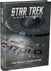
Late last week, Modiphius released links to preorder their new Star Trek roleplaying game, Star Trek Adventures. Visually, it looks cool, perhaps up there with Fantasy Flight Games’ Star Wars RPGs, a series of game books that does a lot of things right. The cover of the collector’s edition is a very interesting angle of The Next Generation’s Enterprise’s main hull, rendered by the same people that provided the 3d model for the Star Trek: TNG Remastered series. The cover of the regular edition is original artwork — an illustration! ((Aside: When we worked on Firefly, we had illustrations for the covers. We heard from the distributors that they would not sell unless we had photos of the crew instead of illustrations — a claim I always thought of as full of crap. It’s great to see that a game based on an existing IP is going forward with an illustrative cover.)) The one spread we have of the interior also features an illustration of Picard’s Enterprise being harried by Romulan ships (and the announcement comes with another illustration of a starship battle!). This leads me to believe they’re going full-on illustration with the game rather than just using stills from existing movies and television shows ((Firefly chiefly did that to save money on production costs.))

But that spread — I’d like to take a few minutes and write down what I really like about it and what I see in the layout.

Continue reading →