Late last month, I wrote about paragraph styles in InDesign. Although at the beginning of that writing, I talked about how I convert marked-up copy with grep searches and why that needed to have standardized naming conventions for styles. When I finished that article, I realized I began by saying “when I first started doing layout” to introduce the marked-up copy concept, and never went into how I currently prefer receiving copy. That way? Word documents.
Marked-up copy has several things that can slow down conversion to layout. Just to name a few: authors have to manually insert [bold], [h2], and other tags; an author might not close the tag correctly, which will mess up your grep queries; an author might label things like the headings incorrectly.
A Word document seems to take care of all that.
If I’m lucky, there’s one writer on a project and all of her or his chapters are going to be consistently styled within the documents. That’s because in Word a writer can quickly and easily specify heading styles to paragraphs, create bulleted and numbered lists, create a sidebar style or example text style and use that to color the backgrounds of paragraphs. Each time the writer clicks on the Heading 2 style, the paragraph has a Heading 2 style applied to it, that data hidden from the user but the effect — a blue color at 13pt in the image below — visible.

Place the saved document into InDesign.
 You’ll see it drop in with the styles from Word applied. Over in the Paragraph Styles palette (or “window”, but I’m old school), you can see that two paragraph styles have been created: Normal and Heading 2. In the image to the right, on those two lines, we have icons on the far right indicating the style wasn’t created within InDesign, but was imported from another source.
The imported paragraph styles aren’t going to be what you want for layout, but they’re the first step: you’ve got a style name associated with each paragraph.
At this point, I’m assuming you had the correct “basic copy” and “heading 2” styles defined for your InDesign project. Given that, we just right-click on the imported Heading 2 style, select “Delete Style” and you get a new dialog box that reads: “Delete Style Heading 2 and Replace With: [Basic Paragraph]”. Select the correct heading 2 style and bang, all those thin blue 13pt heading 2s have magically transformed into a deep maroon Astrogator BB Bold, all caps, with a 2pt paragraph rule offset by .125″ below, and a .125″ space above, aligned to the baseline — just like your heading 2 paragraph style was defined.
But if I’m working on a bigger project, one with multiple writers sending in individual chapters, I have to take another step before placing the documents inside InDesign. I need to convert each one to the same Theme.
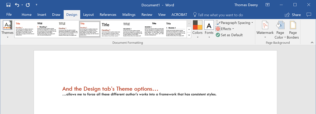
Under the Design tab, you can choose a theme (and then modify the colors and fonts used in the theme). When you do this, the paragraphs that are supposed to be Heading 2 have *the same* Heading 2 style applied to them. If this isn’t done and you place document after document in InDesign, you start getting multiple Heading 2 styles showing up in the paragraph styles palette, all of which need to be deleted.
Once placed, the imported Word paragraph styles are deleted, replaced with the ones defined within InDesign.
While it’s easy to apply paragraph styles in Word — even bullet lists get a style when you click on the bullet list icon — one thing that I’ve noticed is easy to not do is apply actual tagged styles for characters.
To make something bold in Word, previous version have a big bolded B button, like you see in gmail, wordpress, and other such programs that let you do text styling. If you’ve been using text editors for long enough, you probably know the keyboard shortcuts to apply bolding or italicizing or underlining to copy. While there is a style called “strong” that applies a character style to the selected text, it’s not as well-known as that B button, it isn’t obvious that this is how you really should be bolding text, and it’s not always easy to get to in Word.

This is important, because when you click on the B, I, or U button, you are placing an override on the selected copy instead of telling Word that you’re using a new character style. When placed into InDesign, the text has an override applied to what was bolded instead of a character style called Strong, which can be manipulated within InDesign. In the layout program, if you replace Strong (imported) with strong –Â which is defined as Bold, maroon, and in all small caps — the “bolded” text defined by overrides won’t change.
Also, here’s a thing that might throw you in Word: in the image above, the first occurrence of “these words” is bolded using a keyboard shortcut and the B button is indicated that it is active, but I have the cursor in the second occurrence of “these words”, which has the Strong style applied to both words. Even though I have a character style selected, the B button still indicates that it is active, even though it’s just an override.
Getting all these ready for layout requires three different, similar searches in Word.
Using the Replace dialog, which reads “Find and Replace”, select the “More > >” button in the lower left. For “Find what:”, open the “Format” dropdown and select “Font”. Under Font style, select the style that you are replacing (Bold Italic, Italic, or Bold). With the cursor in “Replace with:”, open the “Format” dropdown and select “Style”. You have a teeny-tiny dialog that only shows six options at a time. Search for the replacement style that you’ll want to manipulate in your Character Styles palette in InDesign (Subtle Emphasis, Emphasis, or Bold).

Once you have these searches done in your Word documents, save them, close them, and place them into your InDesign document.
There are a lot of words up there, but this process seems to be much faster than going through and maintaining multiple grep queries.
My typical character styles palette begins with the following:
- strong
- emphasis
- strong emphasis
- game title, if this is one book in a line of product
- book title
- layout note
- …and if we have sidebars, possibly sidebar strong, sidebar emphasis, sidebar book title, and others.
That layout note thing is something I create that is obnoxious. It probably an all caps setting, a red color for the copy, a thick yellow underline with a shifted offset that make it look like highlighting that I use in the book for in-line notes. When I think the book is done, I can click on the submenu for the character styles and choose “Select All Unused”. If layout note is highlighted, it’s no longer present in the book and we’re good. If it isn’t, I just do a find, search for that style, and see where it still remains in the book.
Unlike paragraph styles, I usually wind up with about a dozen character styles.
Oh, I didn’t talk about tables. Here, quickly: writers, have each line of your table be on one paragraph in Word, have each column’s entries separated by a single tab.
Do not layout tables in Word using their table tool.
Do not include multiple tabs so all your entries look nice and neat in Word.
Do not put tabs in front of each line to indent the tables.
Do not use line breaks to separate lines in the table.
Do not try to make your table header rows look different.
Just do basic text and tabs. Bold and italicize where necessary.
Early in my layout years, I had a client who did that to every table in his document, thinking it helped me see how the tables should look. It took me hours to undo all his “help” so I could get his tables to work inside InDesign. My first import of his oddly-formatted tables had so many things wrong: entries in incorrect columns, some rows having more columns that others, bizarre colors and font choices I had to strip and change out…it was a nightmare.
This writing was generously supported by my patrons. You can motivate me to create more writings about layout, game design, and layout in games by becoming a patron. Find out more about my writing goals (plus my secret goal) on this site’s Patreon page.